|
Identities for 4 theater plays at Danish Critically acclaimed theater group Grob.
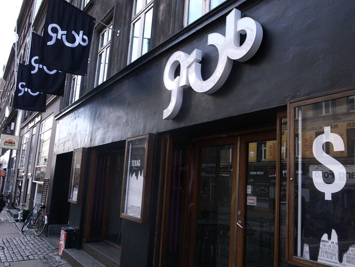
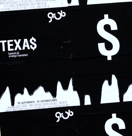
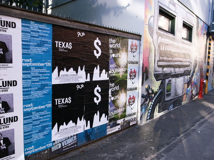
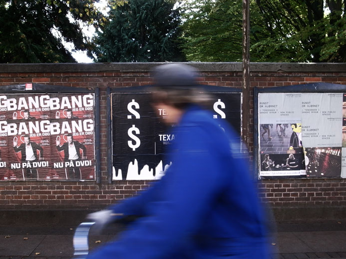
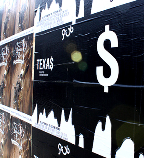
First off Grob used different theaters to exhibit the plays, now they have their own theater on Nørrebrogade in Copenhagen. made at Goodmorning Technology Oily Greed Theater Grob´s latest successful play; TEXAS is based on a true story taking its narrative from oil business scams in Texas. The oily identity is a hint on the theme and also an abstraction of the greediness that takes over the minds of the wire puller setting up oil-scams such as these and leaving plenty of victims in the wake. The oil is used as a dynamic graphic element in posters, programs, online and newspaper advertising, intruding more and more on the media and overlapping the text. In the streets, the poster - in two versions - creates a long ‘slick’ of oil leaving a strong visual impression. |
|
|

|
|
|
|
HOLD YOUR HORSES
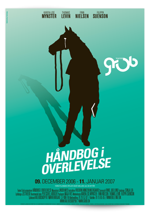
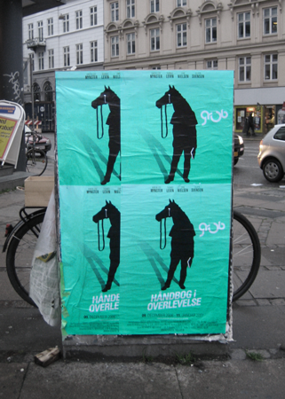
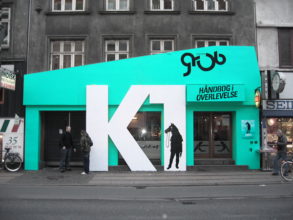
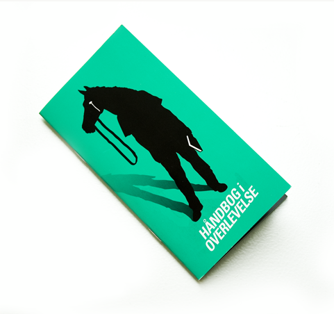
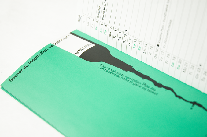
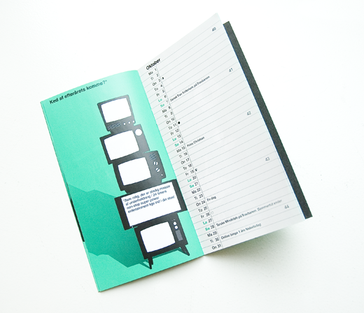
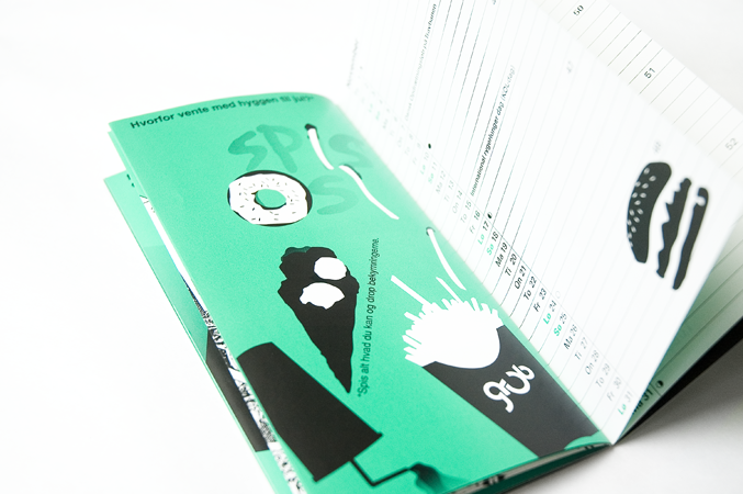
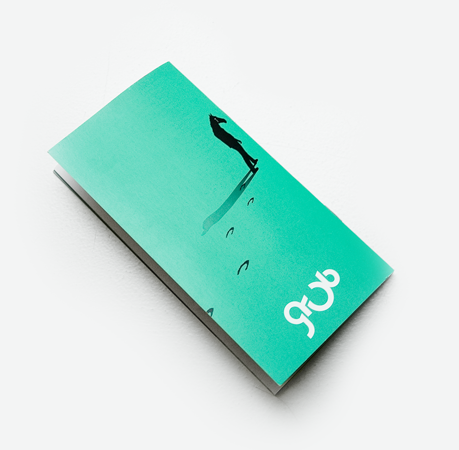
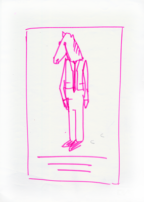
Complete design for the two time Reumert Award-winning play "Håndbog i Overlevelse". The design for this play took its inspiration in the general atmosphere of the title translated to Manual to Survival. The plot is set on the horse tracks, where four lost soles meet Sunday after Sunday. In a mixture of gambling, money, love, booze and secrets the story plays out. The symbol portrays the fight within the main characters; the fight against themselves, each other, abuse and a life-threatening disease. And, as the plot climaxes, the literal fight between man and horse, in a race against the clock and life it self on the racetrack. The approach to the design concept was taken in such a way that the material would have a cinematic feel. The result, with the crying Horse/Man icon, the bright Pantone color and the tilted typography, creates a strong feel and look with exceptional cohesion with the plot of the story. The strength and uniqueness of these features allowed the iconic horse/man to be used both standing, sitting and eg walking away, as on the program. |
|
|
|
|
|
|
|
|
|
ALL ABOARD
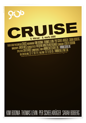
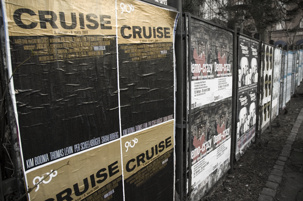
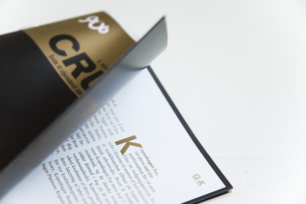
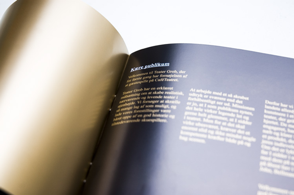
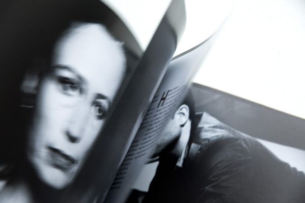
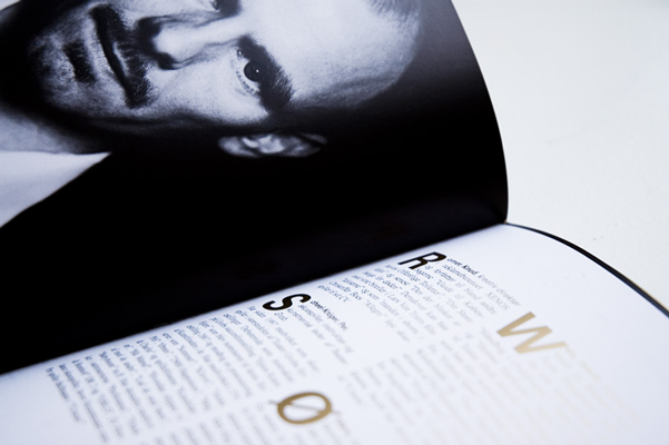
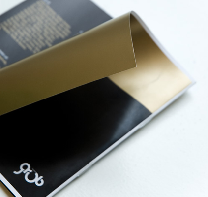
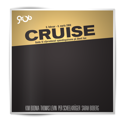
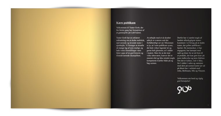
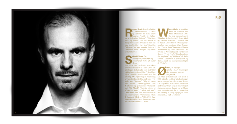
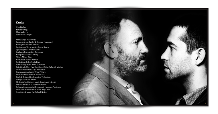
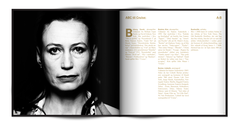
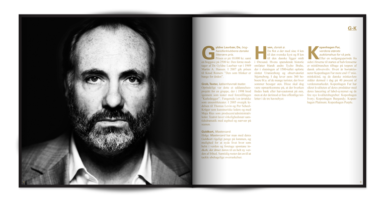
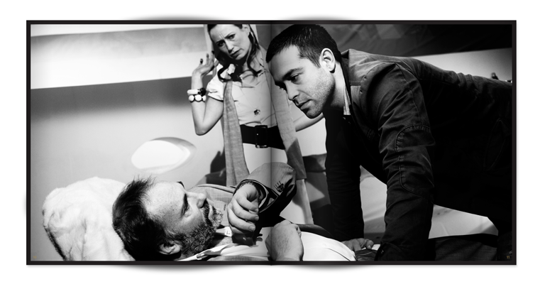
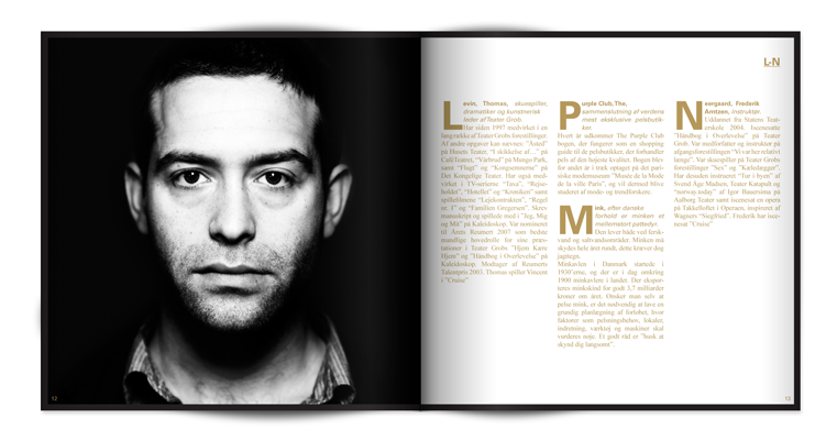
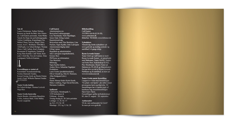
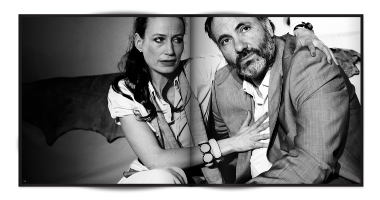
Grob strikes back with an intense theatrical drama with an impressing cast; Kim Bodnia, Thomas Levin, Per Scheel Krüger and Sarah Boberg. The design is classic and exclusive towards the pompous with the black and the gold printed matter, the dark side almost overtaking the brighter according to the theme of the play. The design features poster, adds, postcards, flyer's and the program for the audience. |
|
|
|
|
|
|
|
|
|
|
|
|
|
|
|

|
|
|
MARRIAGE PROMISES
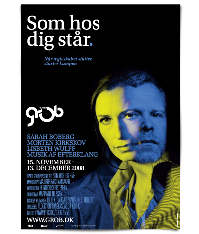
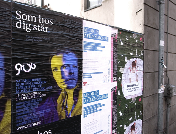
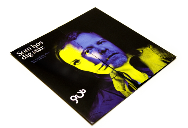
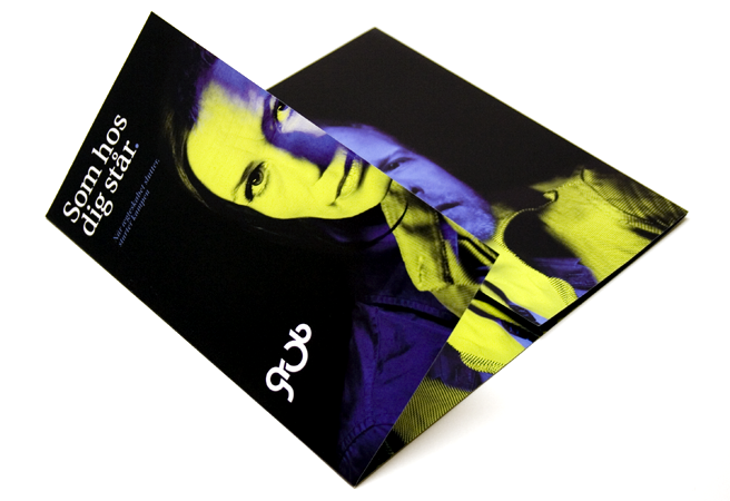
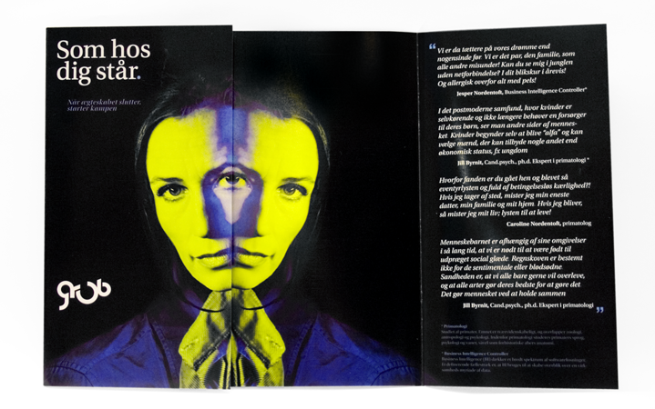
Grob's newest theatric show is an intense family drama with both extreme sorrow and humorous elements, with the under title when the marriage ends, the battle starts. The design is a visualisation of the transformation of two people either growing together as one or falling apart. The colors are contrasting however both cold and cynical not matching just as the characters in the play. |
|
|
|
|
|
|